
Fertilust - Brand Identity & Website
I'm so pleased to finally share my branding and website work for Fertilust! Between its encouraging and playful feel to all of the symbolic depth behind this beautiful brand, it's one I can't wait to pull back the curtain on. So without further ado, I give you the Fertilust brand!
Brand Background
Nathalie, the founder of Fertilust, has been on her own journey with fertility over the last couple years. In that time, she was disheartened to discover the shame so many women feel around their struggle to conceive. Nathalie knew that these women needed to be reassured that there's nothing wrong with them, and—most importantly—they're not alone. And so her personal story blossomed into the catalyst that convinced her to break the stigma, share her story, and inspire women everywhere.

Fertilust - Brand Style
Why invest in branding?
Spending her days working in marketing for a luxury brand, Nathalie is no stranger to what ingredients are essential to build a beautiful, trustworthy, and compelling brand. She knew that if she was going to share this journey and build a brand, she needed a stunningly strategic brand to be the visual to her voice.
After connecting on skype, we both knew it was the right fit. She later told me that my enthusiasm, passion for the project, and the fact that I seemed like someone she'd want to have brunch with sealed the deal for her. Needless to say, this warmed my heart and confirmed my intuition that this partnership was destined for greatness.
The Brand Journey
The thing I adore about Fertilust is the focus not on the stigma or even the end result, but on the journey towards living a healthier and happier life. I knew that channeling an authentic, encouraging, refined and playful vibe might be a tall order, but I was up for the challenge. However, what we ended up creating surpassed even my own expectations.
Logos & Marks
The Fertilust brand appeals to women and men seeking to live healthier, happier lives through their own wellness and lifestyle choices. Its refined yet playful style reflects the support, love, and authenticity behind the brand while the uniquely custom logo and graphic elements set the brand apart and speak to the story and values that make it so special.
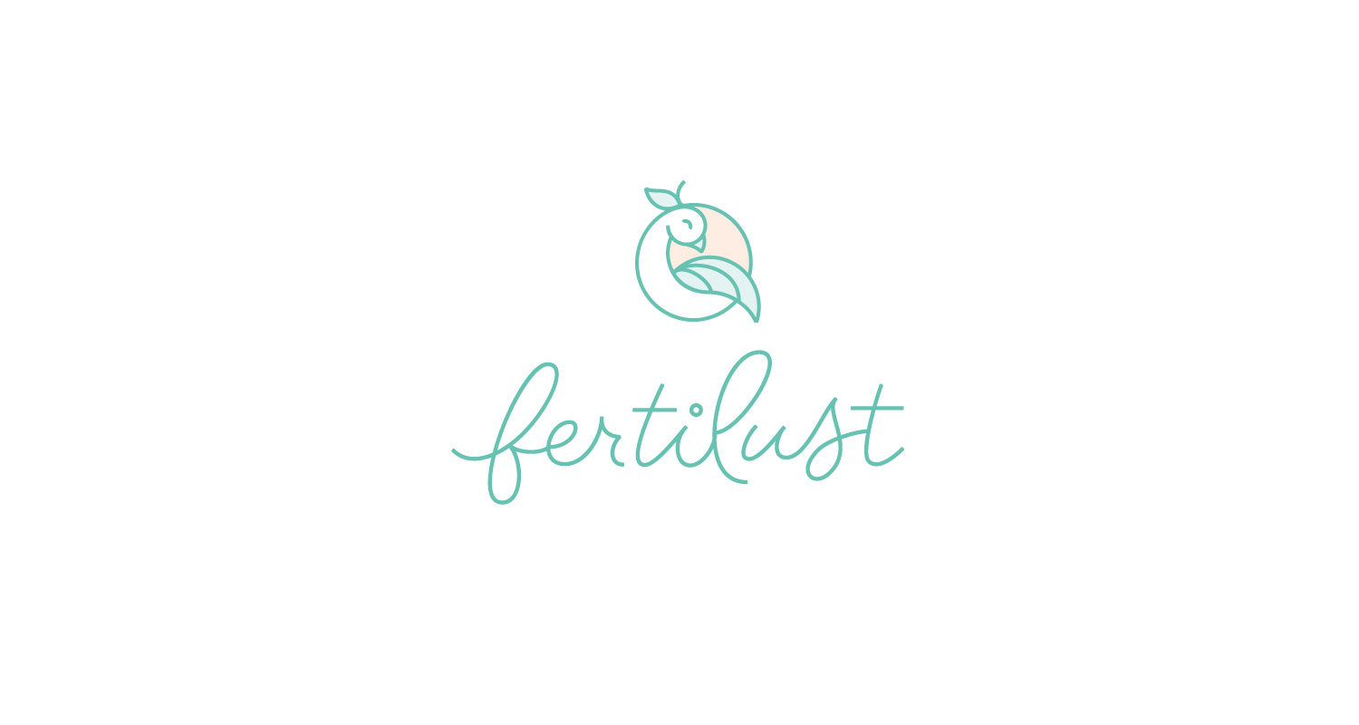
Fertilust - Primary Logo
Behind the Logo
The Fertilust logo centers around the mark and logotype, which are designed to work well at large and small sizes alike, as well as over images. The logotype is made up of monoweight custom script lettering that is both refined and playful.
The mark depicts a joyfully stylized quail—a symbol of love, abundance, and courage—nestled within a circle. This circle embodies a sense of balance and resembles a rising sun, while the plumes of the quail allow the circle to also illustrate an orange. The orange (a symbol of fertility) represents the journey from which Fertilust has blossomed, while also hinting at the food-focused pursuits ahead.

Fertilust - Secondary Logos
The custom script lettering of the logotype gives the brand a refreshingly friendly appeal. Meanwhile the mark exudes a supportive and encouraging tone while holding added symbolism.
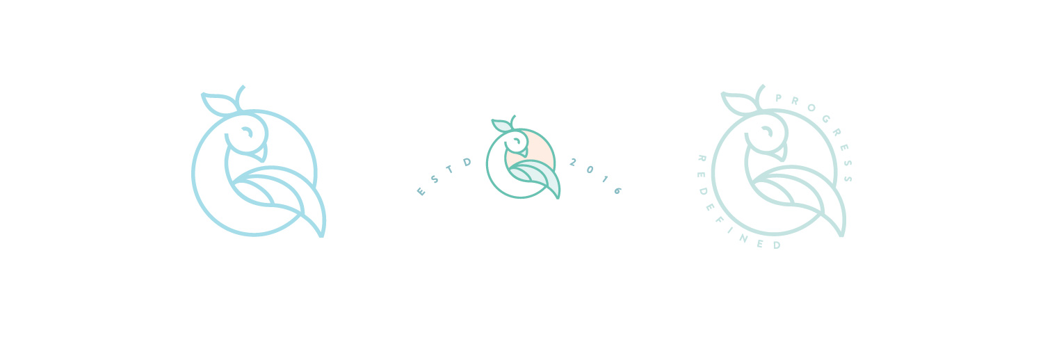
Fertilust - Secondary Marks
Logo & Mark Usage
The primary logo will be used whenever space allows. The secondary logo is used when space is more limited. The mark represents the brand when its name is listed nearby or when it’s used in conjunction with one of the logotypes. Meanwhile, the secondary marks are used to complement the logo and/or logotype when additional real estate allows for them to reinforce each other.

Fertilust - Botanical Tagline
Botanical Ornament
This custom illustrated combines oranges (symbolizing fertility) and botanical elements with an avocado—a symbol of self-love and beauty. This frame visually accents the Fertilust tagline, while also alluding to future food-focused pursuits and adding further visual depth to the brand.
MailChimp Newsletter
My base branding package includes one piece of brand collateral, and since Nathalie will be connecting with her audience on a personal level, an email newsletter template makes the most sense for her to start.
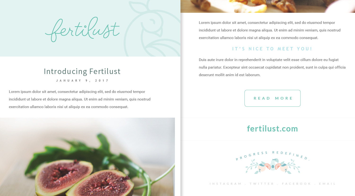
Fertilust - Newsletter Template
I use MailChimp for my own newsletters, and adore their easily customizable mobile-friendly templates as well as the highly whimsical nature of their own brand. As for the Fertilust newsletter, we built a template that would echo her blog posts as well as be used for more personal communications and other brand announcements.
Website
I was also honored to create and help curate Fertilust's new website! I love seeing the brands I create evolve to fit each new context, and the web is no exception. I'm so thrilled with how the website turned out and now that it's officially launched, I can't wait to watch the Fertilust brand grow!
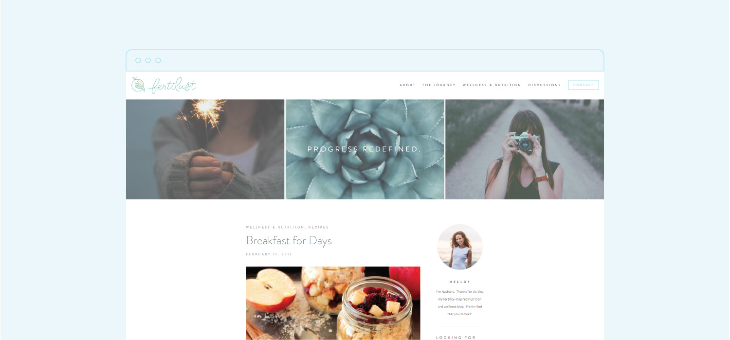
Fertilust - Website
Wrapping Up
This project was so fun and absolutely heartwarming to work on and I couldn't be more thrilled with the results. If you'd like to see more of this beautiful brand, swing by the Fertilust case study page. With this beauty out in the world, I can't wait to see where the brand journey will take us next. In the meantime, I've got lots of other exciting things in the works that I can't wait to share so stay tuned!