Creative, She Wrote: Logo & Brand Design
Way back in January, I started on the brand identity for Creative, She Wrote and it's come such a long way since. I'm so thrilled with how it's evolved and this one definitely has a special place in my heart as one of my first projects while out on my own. I'm ready to dig deep into the process here, but first let's talk about how collaboration took this one the extra mile.
Dreamy Collaboration with Spruce Rd.
Jamie of Spruce Rd. reached out to me a few months back about collaborating on some branding projects. We'd been following each other on social for a bit, but I was still floored by how similar our values, style, and creative processes are. She's been looking to step back a bit from all the one-on-one client work and spread the love. So when she mentioned the possibility of me stepping in on some Spruce Rd. projects while I ramp up with my own business, I jumped at the opportunity.
Creative collaboration is a win for all of us in the end.
Collaborating with the lovely ladies of Spruce Rd. has been absolutely dreamy, and has made going out on my own a lot less lonely. Having people you trust to chat with and exchange ideas with makes such a difference. Creative collaboration is a win for all of us in the end. I know that as my own business grows, my position on the Spruce Rd. team won't last forever. However, having their support means the world and I know we've made bonds that will.
Anywho, let's get back to the branding!
Brand Strategy
Creative, She Wrote is a content strategy and storytelling studio founded by the ultra clever and super sweet Leah W. Her business name is inspired by her love of mystery (i.e. Murder, She Wrote) and her drive to sleuth out gaps in her clients' processes that cost them sales. What truly sets her apart is the creativity Leah brings to such an analytical process, making the name a positively perfect fit.
Once Leah completed the brand questionnaire, we hopped on Skype to get better acquainted and dig deeper into her vision for CSW's new brand identity. And, man oh man, does she have a great vision! Leah's enthusiasm is infectious and we instantly connected through tales of our small business journeys.
Creative, She Wrote - Brand Style
After our in-depth chat, I gathered all my new CSW intel into our 1-page creative brief reviewing the gold nuggets of what I'd learned and laying out a roadmap for our work together. This was accompanied by a moodboard to establish the visual style of the brand. Leah wanted the Creative, She Wrote identity to look and feel bright, clean, and refined with an emphasis on mystery and classic Parisian style. Talk about a lovely mix.
Brand Design
With the framework and style set for our work together, I immersed myself in the design stage of the process. I fleshed out a logo concept that spoke to CSW's brand tones, chose a color palette that evoked Parisian sensibilities, and don't even get me started on the custom patterns and other assets I created.
Logo
Leah and I chatted a lot about the importance of putting the emphasis on the users—the customers of her customers—instead of just her clients. So on the logo front, I started out creating a look that was clean, bright, and put the emphasis on the “she” of Creative, She Wrote.
After presenting the first proof to Leah, she loved the the identity (especially using the mark I created and used as a stamp with the logo), but pointed out that the emphasis should really be on the “creative” portion of the name since that's what really sets her apart.
Logo - Round 1
Logo - Round 2
In the second round I switched up the hierarchy and simplified the look with all sans serif type per the stylistic inspiration. However, we agreed the logo still seemed to be missing that custom quality we'd created throughout the rest of the identity. Leah pointed out that she'd love for the type to have more energy and that Parisian sensibility we'd pulled in through the color palette.
Creative, She Wrote - Final Logo
So in the final round, I knew I needed to bring it home and wrap up this identity with something amazing. What better way than with some completely custom type? I got to work and after a bunch of heads-down time, had this beauty to show for it. I also made sure that CSW's logo had a few alternate versions too, which are great for different contexts when there's more or less real estate to work with. This allows the identity to be even more versatile for Leah's needs.
Creative, She Wrote - Logo Variations
Leah was absolutely head over heels for this last iteration, as were Jamie and I. Although we can't hit it out of the park the first round every time, that collaborative aspect of refinement is so important. Together we created something even better, and I'm so thrilled that Leah's thrilled and that this identity is going to work wonders for her new business.
Custom Patterns
Now let's dig into a bit of the other brand elements we created. If you follow me just about anywhere, you know my passion for custom patterns. Well in this project, I went a little pattern crazy in the best way.
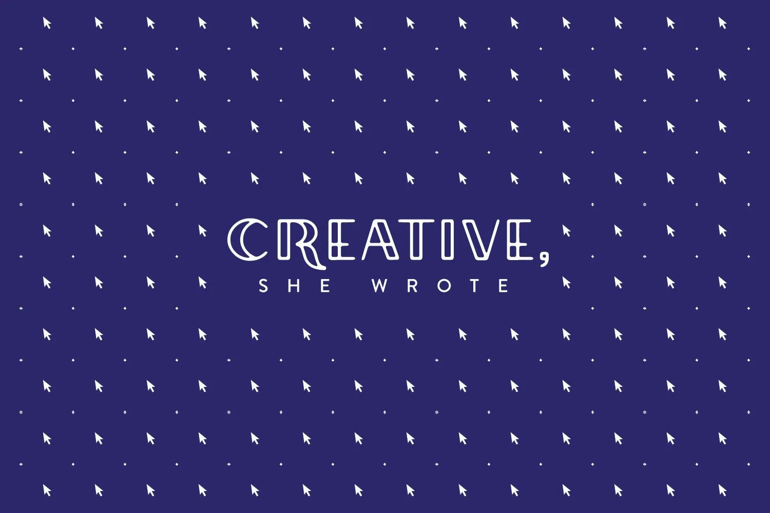
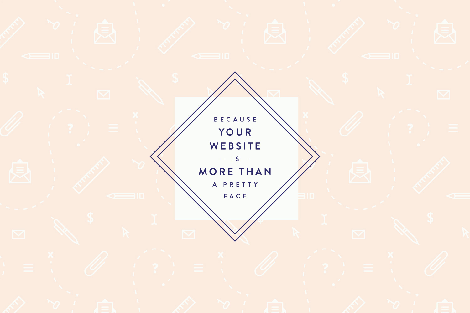
The Creative, She Wrote patterns add a new layer of depth and intrigue to the identity as a whole. The blush pattern above fuses elements of the user experience with CSW’s services, emphasizing the air of mystery around Leah’s hunt for gaps in her customers’ content.
The arrow pattern riffs off of a simple polka dot pattern, putting the emphasis on the users and encouraging their action, while the notebook and envelope patterns incorporate writer’s tools in a playful way. These patterns can be used in blog graphics, social media, newsletters, stationery, and other branded elements. I warned you that I went a little nuts with the patterns... and just wait til you see how we're using them.
Brand Assets
The great thing about custom patterns created from icons is you can pull those icons out for individual use throughout the brand. It makes the whole identity even more flexible while keeping that custom yet cohesive feel. I did just this for Creative, She Wrote—pulling out the best of the icons for her to use in blog graphics among other things.
Creative, She Wrote - Custom Icons & Graphic Elements
To tie the whole thing together, I created a couple lock-up graphics for Leah's taglines that she can sprinkle throughout her site and brand collateral.
Coming Up
I'm so pleased with how the Creative, She Wrote brand identity has turned out and have enjoyed my first collaboration with Spruce Rd. more than words can say. Stay tuned for more exciting collaborations coming soon. Cheers!


