
Plain Janell: Logo & Brand Design
I'm so excited to unveil my latest brand identity project — another wonderful collaboration with the talented ladies of Spruce Rd. This one is for the lovely Janell Strouse, a super sweet Ohio-based photographer who specializes in high school senior photography.
Janell prides herself on making her clients feel instantly comfortable in front of the camera, and captures real laughs and smiles that allow each senior's authentic to self shine through. Janell makes her clients look and feel amazing in their photos, so they can show them off and capture this exciting time in their lives the way they want to be remembered.
Brand Strategy
When I learned that Janell focused exclusively on high school senior photography, I was beyond intrigued. There are so many niches within the photography world, and I couldn't wait to hear what drew her to this one. In our kickoff meeting, Janell explained that she loves everything senior year represents—the excitement, anticipation, fun, and endless potential. It's the year her clients have been waiting for their entire lives, and it’s only the beginning of their adventure.
Plain Janell's clever play off of the traditional “Plain Jane” has a great ring to it, but when I got to know her even more I realized just what a perfect fit the name is. Janell's style is simple, clean, and light-hearted. She believes basic is beautiful, and is a t-shirt-and-jeans kinda gal who can rock a little black dress when the occasion arises. I couldn't wait to dig into designing her brand identity and infuse her simple yet classic style with an emphasis on adventure and a touch of sass.
BRAND TONE
Simple, Clean, Lighthearted & Authentic

Brand Design
My two primary focuses when crafting a brand identity are always creating something that feels right for the brand (both owner AND audience), and making the design solutions really versatile for my client's needs. I mean, what's the value of a beautiful logo and identity if you can't use the heck out of them? Exactly.
I particularly love Janell's brand name because it's versatile in itself—the name is totally unique yet it doesn't confine her to the high school senior niche. So as her path unfolds, the Plain Janell brand will give her plenty of room to grow, which is just as it should be.
Logos
As I began sketching out logo ideas, it became clear that a custom script logotype would be the perfect direction for the Plain Janell brand. It would inherently have that beauty and uniqueness baked in, and I could really dial in the classic-meets-authentic vibe we were looking for. I kept it clean by digitally vectorizing all the type, and the consistent line weight throughout keeps the air of simplicity intact. When it came to color, I chose a palette of gold and denim-inspired hues to play up that simply classic tone even more.

Plain Janell - Logo Variations
Meanwhile, I made sure to create variations of the logo to make it really flexible for Janell. The primary logo keeps everything on one line, while a secondary version stacks the type for instances where she needs something more compact. Notice how that swash from the “l” nestles perfectly into the negative space of “Janell”? Those little details make all the difference. And let's not forget the mark! The simple monogram fits together just right, and it's ideal for her website favicon and other subtle touches throughout the brand.

Plain Janell - Custom Patterns
Patterns
You're probably already aware of my passion for custom patterns. I absolutely love how patterns are a unique opportunity to channel a brand's essence into something that will take the whole identity to the next level.
In the case of Plain Janell, I thought the simplicity and classic nature of stripes was a home run. Specifically, I was inspired by classic oxford shirts and how if you look closely at a the weave of a striped button-up, it's made up of so many smaller details. That seemed like a perfect metaphor for Janell's brand—simple on the surface, but full of so much subtle beauty, complexity, and depth. Not to mention, stripes have the just the right flavor of preppiness!

Plain Janell - Brand Icons
Custom Icons
Alright, I'm especially excited about these icons so let me take a second to collect myself.
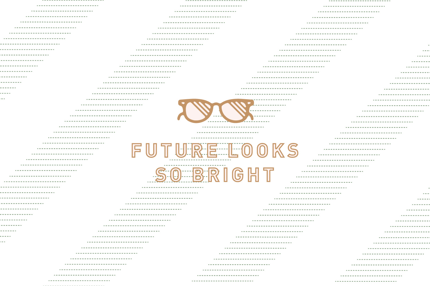
The goal here was to create some lovely, custom symbols that would add yet another layer of depth and interest to the brand. They obviously had to look cohesive with the rest of the brand, so I took the same smooth, monoweight approach to the style. We decided the icons would coincide with Janell's blog categories (from left to right: Future Looks So Bright, 365 Days a Senior, Photography, Lovely Adventure), but I couldn't stop there.
I wanted these icons to be just as versatile for Janell and to give her just as much room to grow as the rest of her brand identity. I initially sketched some grad caps and diplomas, but those seemed too specific and I didn't want to pigeonhole Janell. Not to mention, icons are always worlds better when they add something new to the content, instead of just repeating what's already been said. Verbal + visual = message, folks.
So instead I created icons that would apply to Janell's current blog categories, but could also grow with her brand. The sunglasses are for her “Future Looks So Bright” category, which makes sense but they're also a fun lifestyle icon for her brand. The “365 Days a Senior” icon is a whimsically abstract take on the “365” that pulls in a sense of comeradery with its intertwining numerals and even resembles a camera lens. The camera icon fits the posts Janell will write about photography, but also represents the adventures she'll capture along the way. Finally, the arrow has an air of wanderlust but will also be really flexible as Janell dabbles in travel and expanding her brand down the road.
Above you can see how one of the icons might be paired with type and one of the patterns, and you may or may not also see this treatment popping up on a couple of Plain Janell's social accounts.
I adore that the phrase “Future looks so bright” is so much more than one of Janell's blog categories. It's a message of hope, anticipation, and resounding optimism. I'm absolutely thrilled with how the Plain Janell brand identity came together. We should all take a page from her book and be so excited about the adventures coming our way next!