

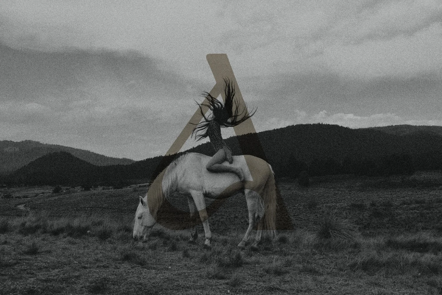
I’m extremely lucky to do what I do for a living, helping female-owned small businesses thrive through sophisticated custom branding that brings their vision to life and speaks to the souls of their dream customers.
I’ve always known design is a good fit for me, but as a mom of young kiddos, certain things in life become so much more clear when seen through their eyes. As my little ones continue to grow, imagining what they want to be when they grow up and becoming more aware of what Mommy does, one thing that’s abundantly clear to them is that Mommy loves her job.
It warms my heart that my career opens that possibility wide for them — not just working to live but finding a calling that brings them joy and feeds their soul. With each new branding project, I realize more and more that I am supremely blessed to do what I do, to work with amazing small business owners, and to help them bring their dreams to life.
Amanda Jaggan of Dark Horse Collective is an incredible example of an inspiring female entrepreneur, and I’m beyond thrilled to share the journey behind the stunning brand identity we’ve created together.
Kindred Spirits Who ♡ Systems
When Amanda of Dark Horse Collective first reached out to me, I was first struck by how much I loved her business name. It definitely has that “cool” factor that’s just begging for some fierce branding to back it up, but what really hit home was when Amanda shared that her mission is to “empower women through structure.”
As you may know, I’m a total nerd when it comes to strategic systems and saving time wherever I can (especially since becoming a mom). These systems and meaningful shortcuts are infused into everything I do, from my branding process to my classes for designers. After all, we could all use more time in our days, right?
So when Amanda shared her special affinity for systems and her goal to help passionate women entrepreneurs who are drowning in their business tasks to find freedom through bespoke business consulting and systems? And that she also dreamed of building an empowering community of female founders along the way? Couple that with the fact that she’s also a mom navigating a small business with a little one in tow, and I knew I’d found a kindred spirit. I couldn’t wait to dive in.
The Branding Journey
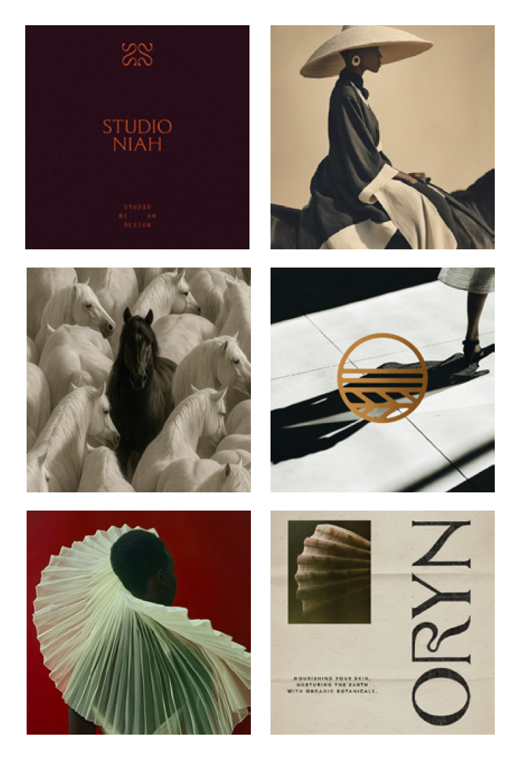
Before I even think about design, my branding process always begins with discovery and strategy — learning as much about my client’s story, their mission, and dream customers as I can. I then distill this down into a one-page document and inspiration board that guides the rest of our work together. This shows my clients that I truly understand their vision and ensures we’re on the same page with both content and visual style before we move forward with design.
This discovery phase is the key to creating a unique brand that truly feels like you and aligns with the soul of your mission.
Some things that really stood out to me during the discovery phase with Amanda was the DHC tagline “freedom through structure,” the focus on empowering female entrepreneurs, creating a brand that radiated a sense of belonging and community, and a brand voice that was bold, confident, and unapologetic. When Amanda shared her visual inspiration for the brand, it was this swoon-worthy blend of organic avant garde, sculptural minimalist, and modern nomadic style.
It all started to come together from here.
Raw & Refined Style
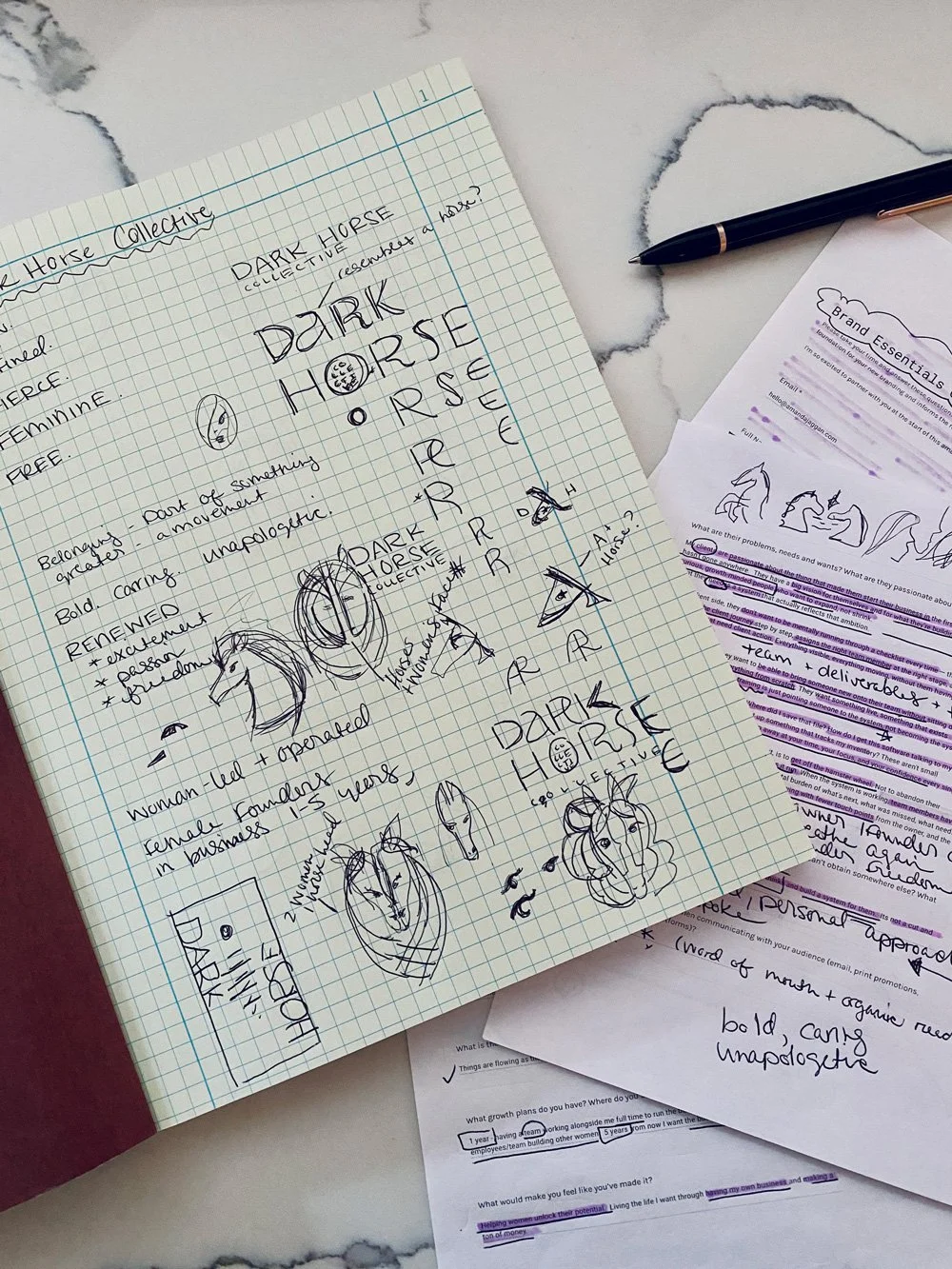
I knew we could create a really sophisticated logotype with custom details that hit that fierce yet sophisticated vibe. I also loved the inherent contrast of raw versus refined within the brand tagline “freedom through structure” and thought it would be really interesting to explore the juxtaposition of bold refined lines with raw earthy textures. This could also play out nicely in a sophisticated yet earthy color palette.
The Making of An Iconic Logo
Now for a simple brand identity, a strong logotype and color palette might have been enough. But I couldn’t get the themes of female empowerment, community, and belonging out of my head. I kept coming back to a line from Amanda’s brand questionnaire that read, “We’re the ones you didn’t see coming, and we run together.” This wasn’t just about one woman’s business. This was a collective — a movement of passionate female entrepreneurs lifting one another up. Together, these women are Dark Horse Collective.
I realized that was the key, and that’s when I had an idea.
What if I could create a brand mark that had two women’s faces hidden within the image of a horse? Would that be crazy? Probably. Is it even possible? Maybe. Am I going to try it? Absolutely.
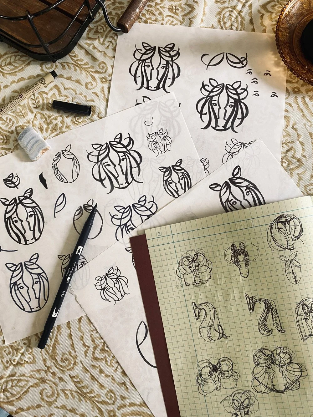
Cue hours upon hours of exploration and tweaks to make this idea work. I tried drawing it by hand for contrast and a more organic texture, adding decorative flourishes with the hair to give it an interesting shape, and playing with the relationship of solid shapes and outlines together.
On and on and on it went, but I could feel that it still wasn’t right. I thought about giving up on this direction several times, but the idea of a brand logo that held so much meaning while being an abstract optical illusion was just too cool to abandon. So I kept going. I tried and tried and tweaked and tinkered and finessed, and finally — FINALLY — it worked.
I design by feeling, and when a logo or brand element is right, I can just tell. That’s the feeling I got with this horse logo, like “Eureka! I’ve done it. This is it.”
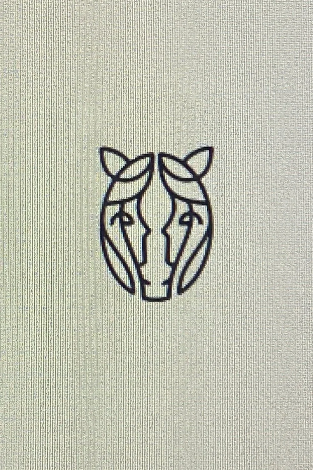
In the end, the idea was the hero (or heroine rather) and I decided to remove any extra details or textures that might distract from it, simplifying it as much as possible.
After all, brand design is like orchestrating a symphony and the key is to take all these separate elements — logos, marks, color, texture, typography, photography, etc. — and make sure they all play and melt together well to become a sophisticated and seamless brand experience. No one element has to do it all and we also can’t have too many elements trying to do the same thing and overdoing it.
Balance and nuance are what makes that makes a brand sing.
So with a deceptively simple execution of this complex idea, I finally got there on the horse mark (or “the Equestria logo” — as I described it to my 4yo who loves My Little Ponies). Now all that remained was to put it all together, right? Not quite…
The Submark Gap & Keeping It Versatile
After finally making this bold beautiful logo idea work, I felt like I was on top of the world. Like I’d moved heaven and earth. But as I started to pull the brand together to test it out, I realized that even this minimal mark was too complex for certain contexts (browser tab favicon, I’m looking at you).
I pride myself on crafting custom brand identities that are equal parts sophisticated, strategic, and soulful. Versatility factors heavily into this, since what good is a beautiful brand if it doesn’t work where you need it? With this small but important gap in mind and my (somewhat unreasonably) high brand standards, it wasn’t enough. So back to the drawing board I went and, let’s just say, I’m so glad I did.
I returned to an earlier idea that had still been floating around in the back of my mind.
What if I created a custom “A” letterform for the Dark Horse logotype that hit the sculptural minimalist and avante garde style we were going for, while also hinting at the form of a horse?
Another tall order, I know, but I’d sketched it out in a bunch of ways (as you can see above). I knew it could work, if done right. The key was to make it dynamic and unique, make it feel at home with the rest of the logotype, but also make this abstract allusion to a horse subtle enough that it wouldn’t feel repetitive when the paired with the horse mark.
Insert lots more exploration and many iterations, and me wondering why I do this to myself.
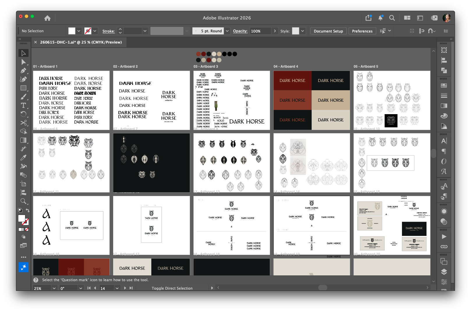
It took time, but when I finally got it, it was so worth it.
This single letterform checked all the boxes. It made the logotype more unique and made the whole brand sing. It read ever so subtly as a horse but didn’t feel repetitive next to the primary brand mark.
This letterform not only worked as part of the logotype, but it looked stunning when used independently, both tiny in that browser tab and large as well — on a solid background, over images, even with an image peeking through like a window. This submark filled that gap in the brand identity and made it complete.
Pulling the Brand Identity Together
Now I finally I had the core brand elements I needed, and it was time to pull it all together. I paired the logo elements with a sophisticated rustic color palette. An Art Nouveau inspired heading font paired with a monospaced one for body copy nailed the contrast of freedom vs. structure on a type level, and the combination had me drooling over the brand typography.
Yes, really good type systems gives us designers feelings.
I designed some truly swoon-worthy business cards combining black and kraft paper with letterpress and foil stamping. Finally, I brought it home with photography that combined grainy black-and-white images, dark moody nature photography, wild horses, and stunning ethereal images of women evoking a sense of freedom and sisterhood.
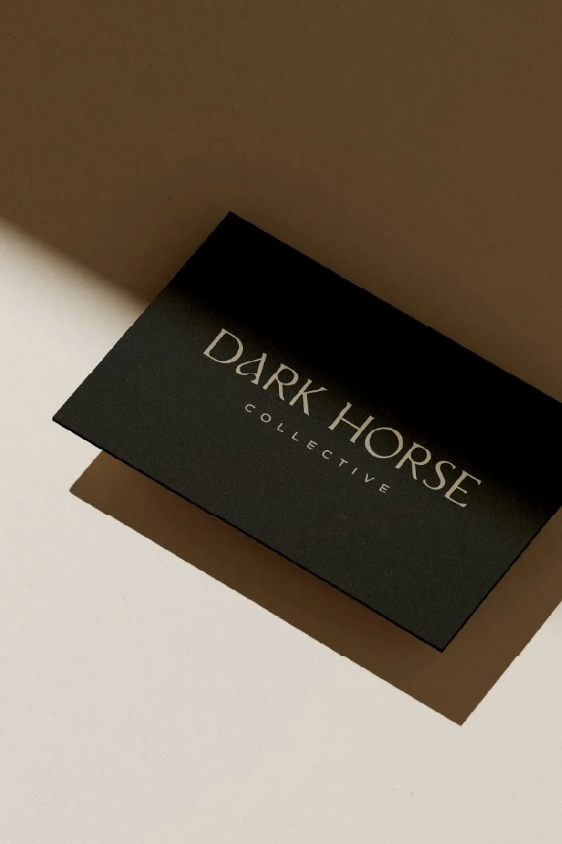
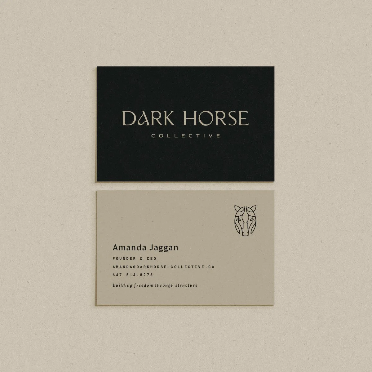
Everything snapped into place and the brand took on a voice and life all its own. I couldn’t wait to share it with Amanda. It truly sang and had such an incredible vibe that I kept referring to it as my “cool girl brand.” I was beyond thrilled when I received Amanda’s feedback on that first round of brand designs. She and her team clearly felt the same.
“Our initial feedback - WE LOVE IT! You have done an outstanding job of capturing my vision. We cannot unsee the two women now in the logo.
I can’t describe just how much I love what you’ve created. I’m so blown away and I’m just really happy that I decided to work with you. In my 37 years on Earth, it is very rare for someone to capture my style — not just on a personal level. This is the vision I had for my brand and you’ve captured it spectacularly.”
Working Through Refinements
From that first round of designs, we only needed some minimal refinements to help the horse mark read even more clearly as a horse and to make sure it read even better at small sizes (as it turns out, some sharper horsey cheekbones were the ticket). I also dialed back the color palette, shifting the deep ruby and crimson to a single clay color that hit that modern nomadic vibe better. I cut the brand color palette back to four colors, and it just felt right. Less but better forever.
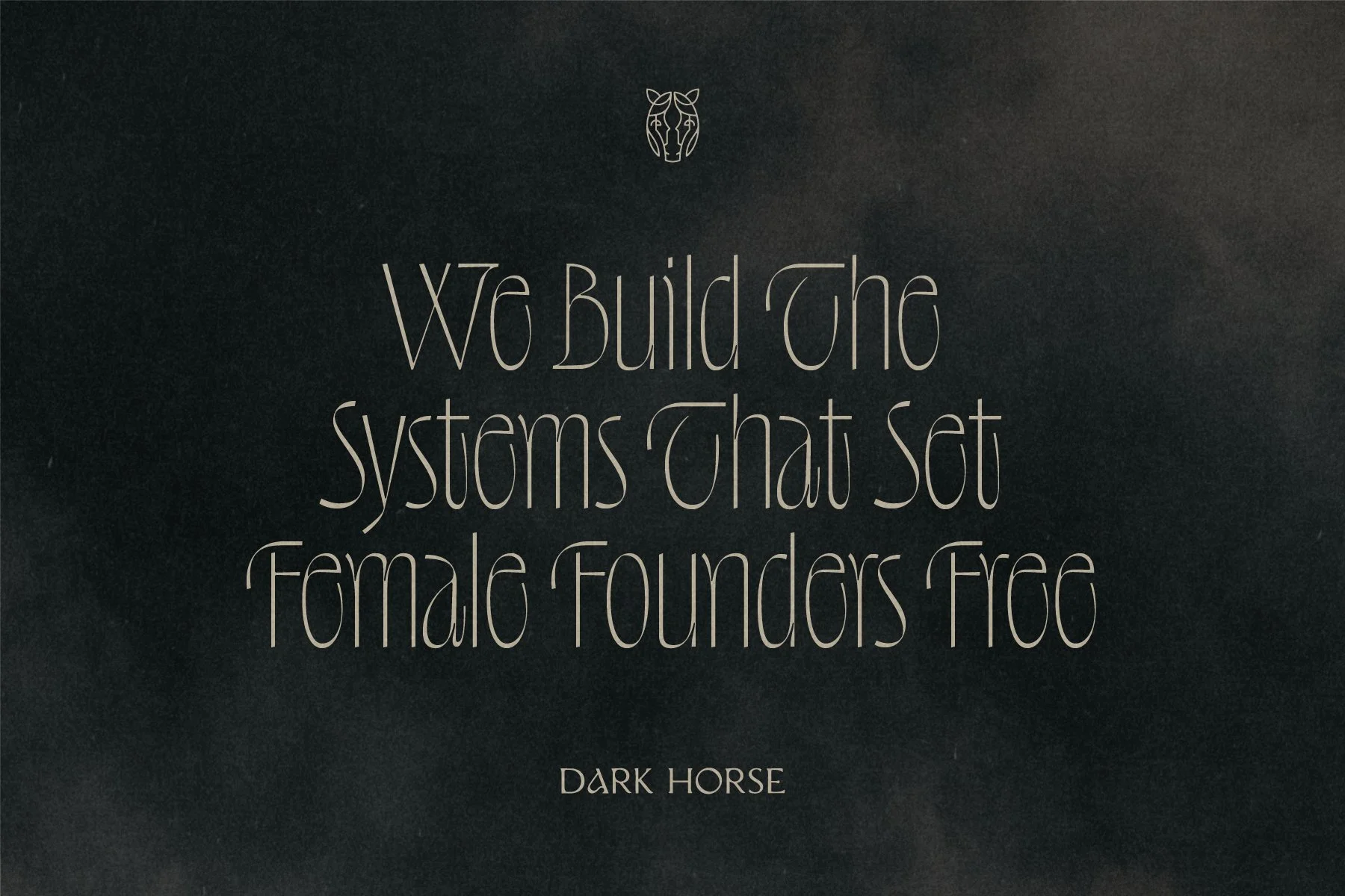
Amanda and her team approved the brand identity without any further changes, and she was absolutely over the moon with where we ended up. Once we wrapped up the DHC brand identity, a simple website was next on the list, and I can’t wait to share more on that soon. For now, I’ll let Amanda’s words on the branding process and our partnership speak for themselves.
“Melissa was an absolute pleasure to work with. From the very beginning, she truly understood the vision for my brand and brought it to life in a way I never could have imagined. I am beyond thrilled with the final result.
What stood out most was Melissa’s genuine passion for her work. It’s refreshing to collaborate with someone who is so creative, thoughtful, and invested in delivering an exceptional outcome. The way Melissa guided us through the process, she made it easy to feel confident in every decision while ensuring the final branding felt authentic to my business.
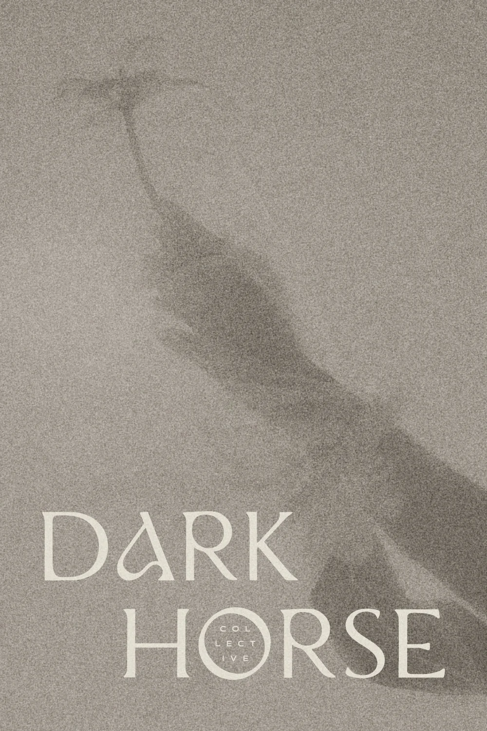
I’ll never forget the feeling of disbelief after Melissa unveiled the designs — that this is my brand. She captured the vision so beautifully, and I got quite emotional seeing the final product. As someone who has dreamt of having my own business for over 20 years, I cannot explain the feeling of seeing it coming to life.
Melissa’s talent, professionalism, and enthusiasm made the entire experience exceptional from start to finish. I couldn’t be happier with the outcome and am genuinely excited to collaborate with Melissa again on future projects. I would highly recommend her to anyone looking for a designer who not only creates beautiful work but also truly cares about bringing your vision to life.”
I can’t describe how thankful I am to have the chance to partner with inspiring female founders like Amanda, and how thrilled I am to finally share the Dark Horse Collective logo and brand identity with the world. Stop by my portfolio to see more of this stunning brand in its full glory.
Until next time!
If you’re a small business owner who’s ready to bring their vision to life and truly connect with your dream customers through a brand identity that’s stunning, strategic, and soulful, drop me a line. I can’t wait to hear your story :)
