

Dark Horse Collective
Raw. Refined. Fierce. Feminine. Free.
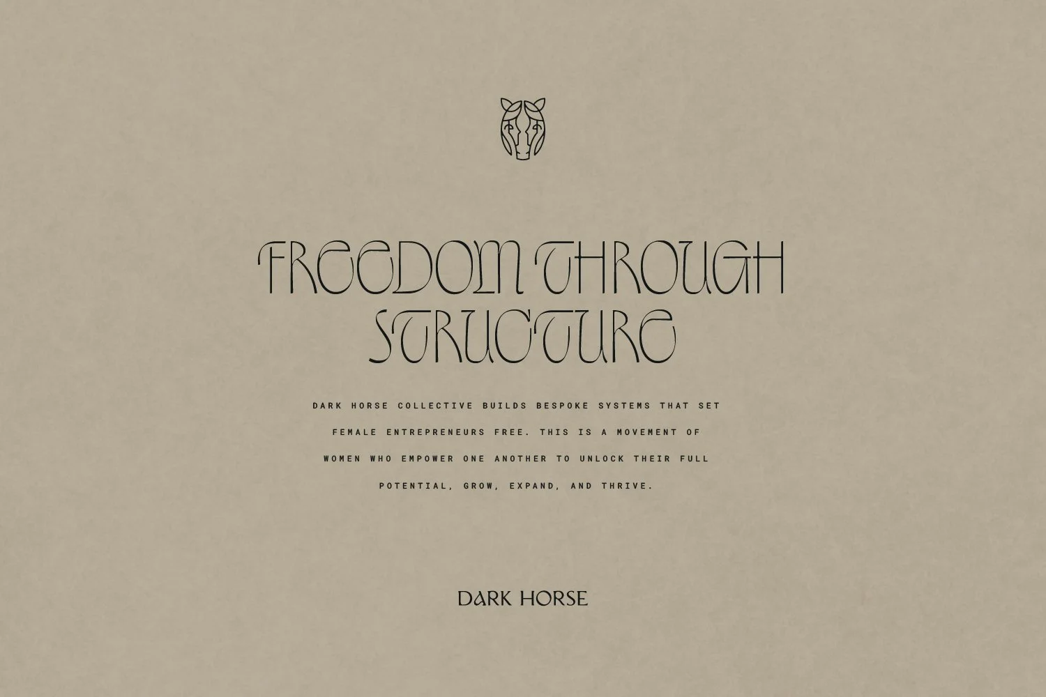
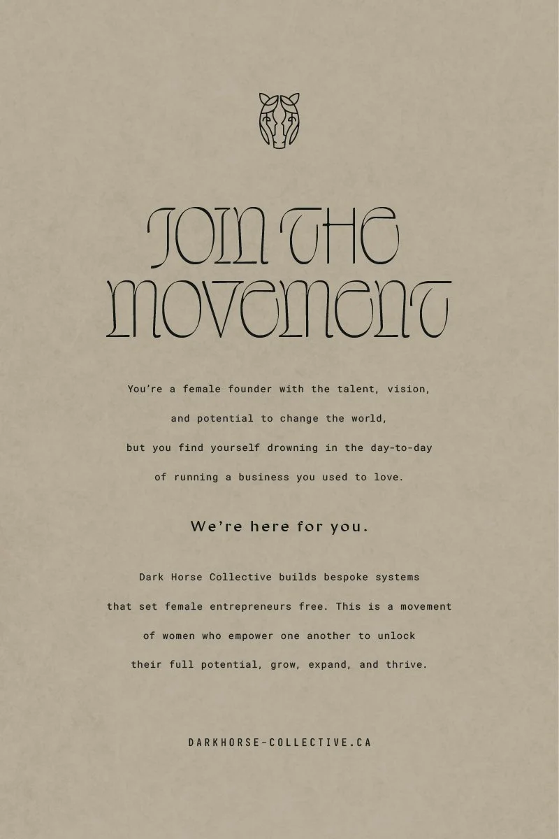
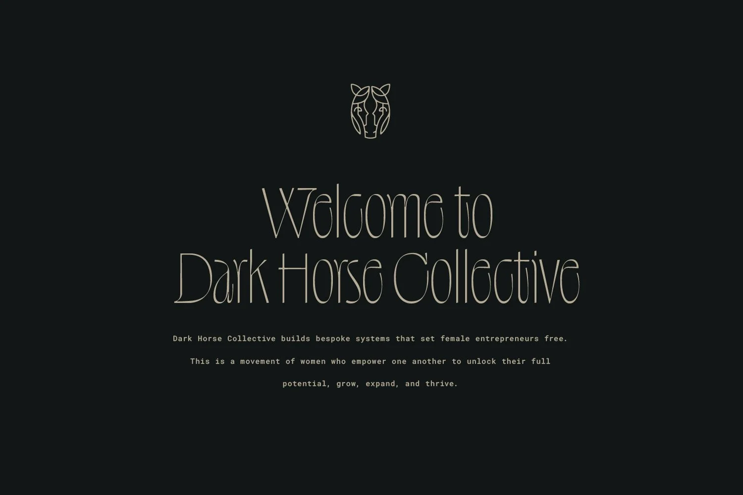
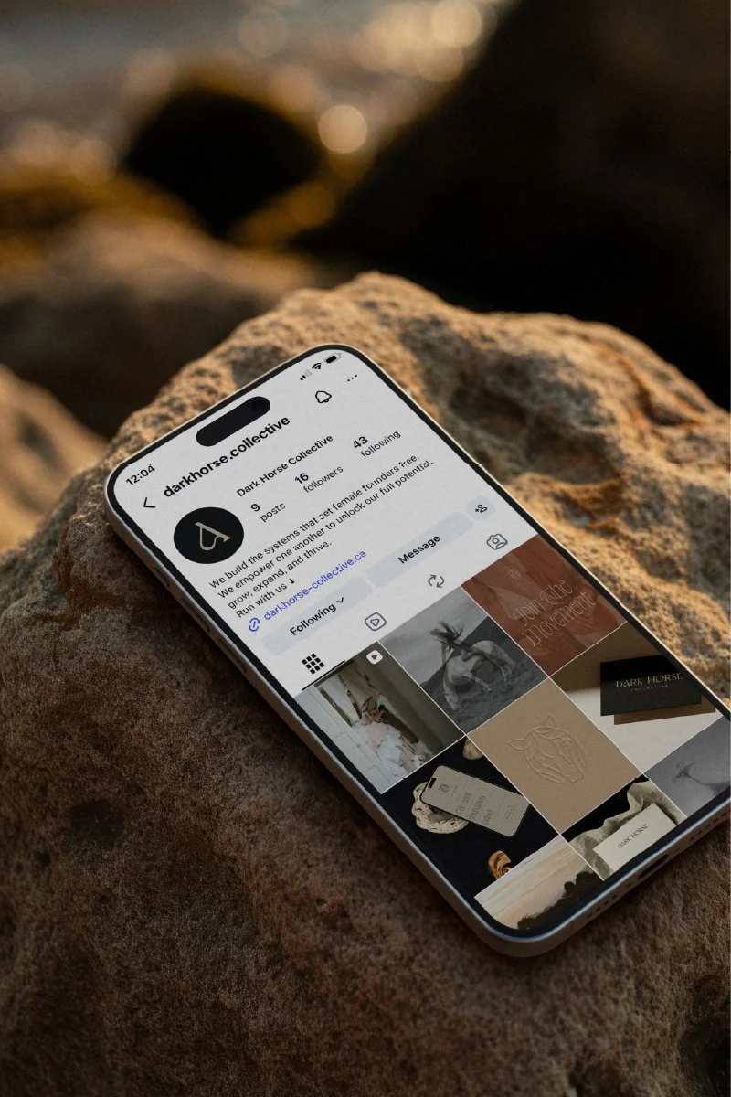
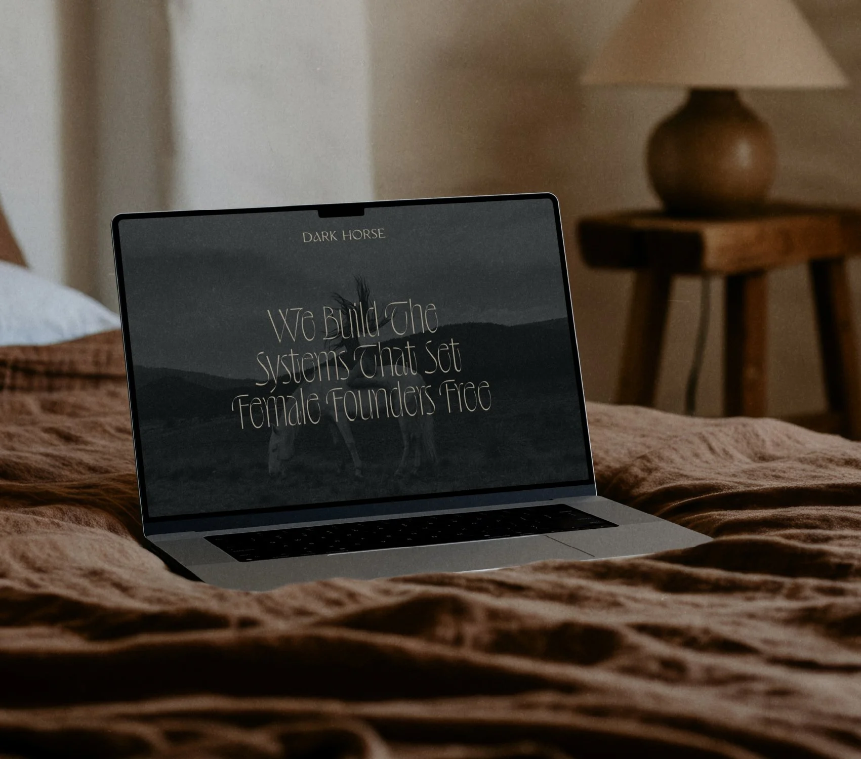
Dark Horse Collective builds bespoke systems that set female entrepreneurs free. This is a movement of women who empower one another to unlock their full potential, grow, expand, and thrive.
Read more about the branding process for this stunning identity →
Services
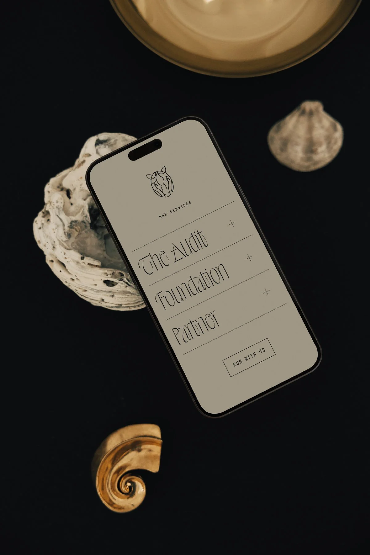
Logo Design, Branding, Business Card Design, Website Design
The Intention Behind the Designs
-
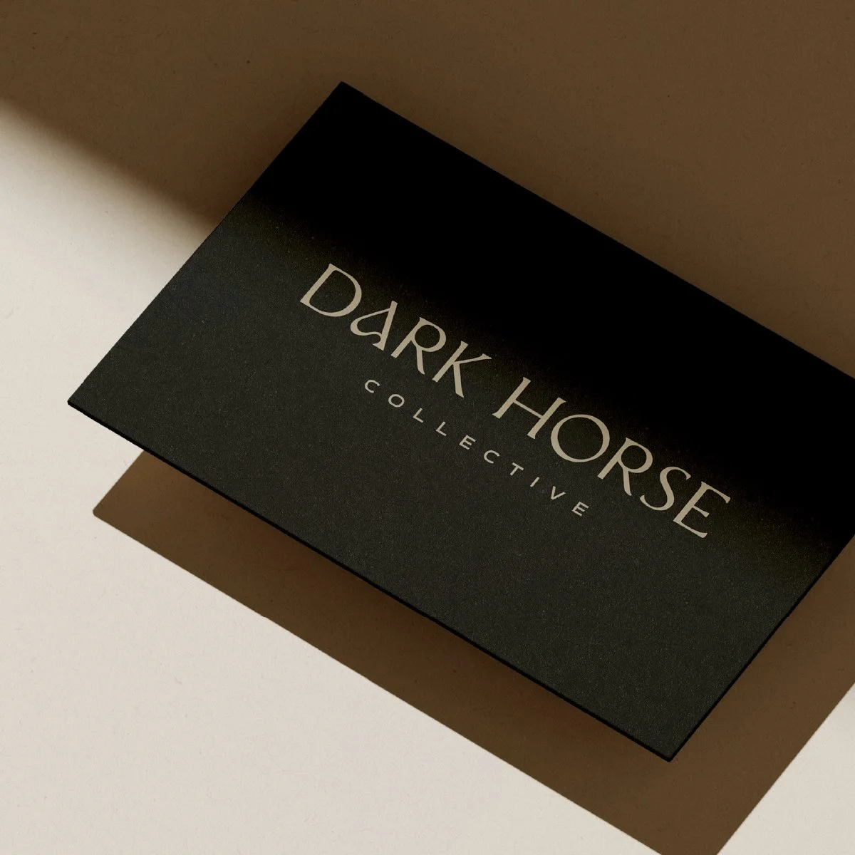
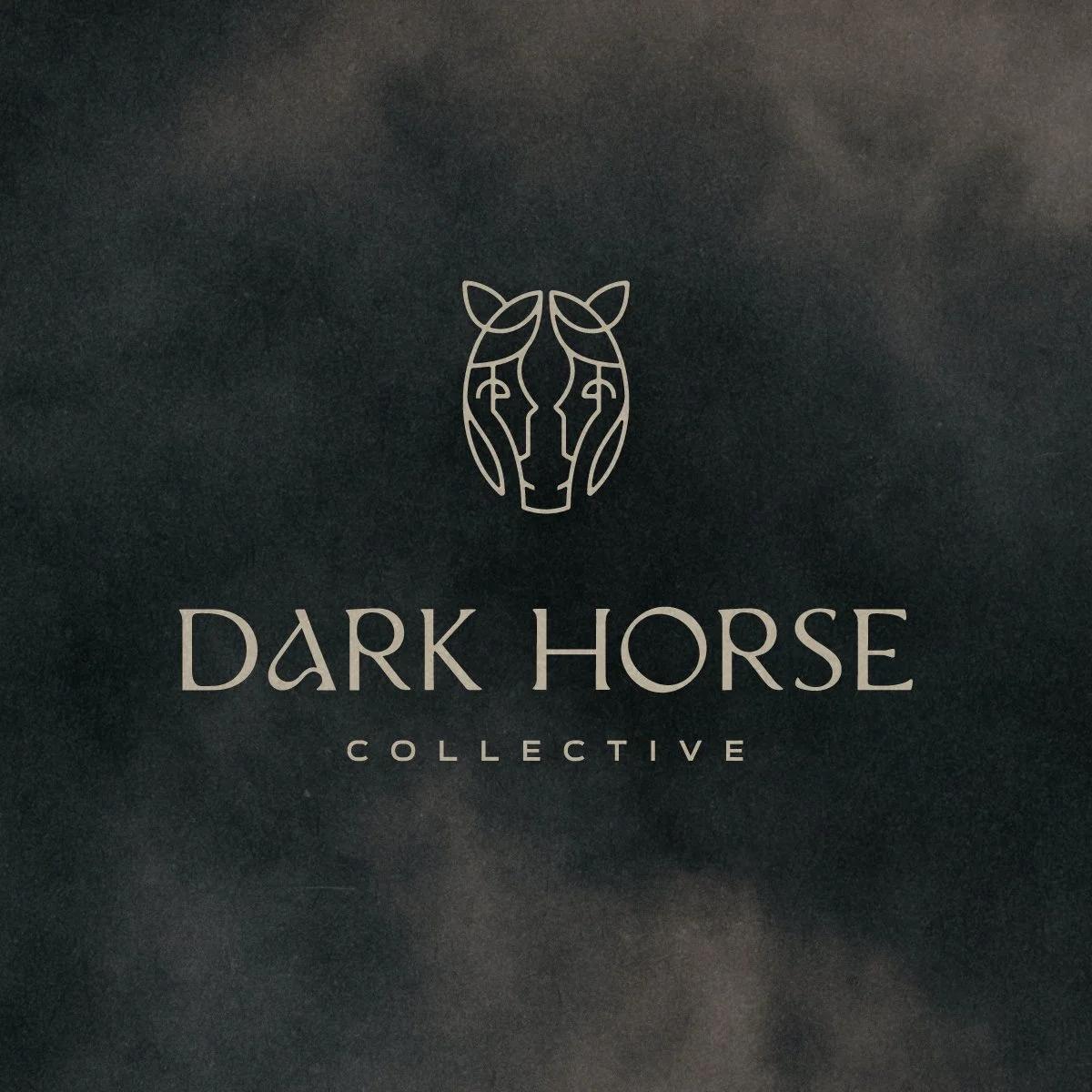
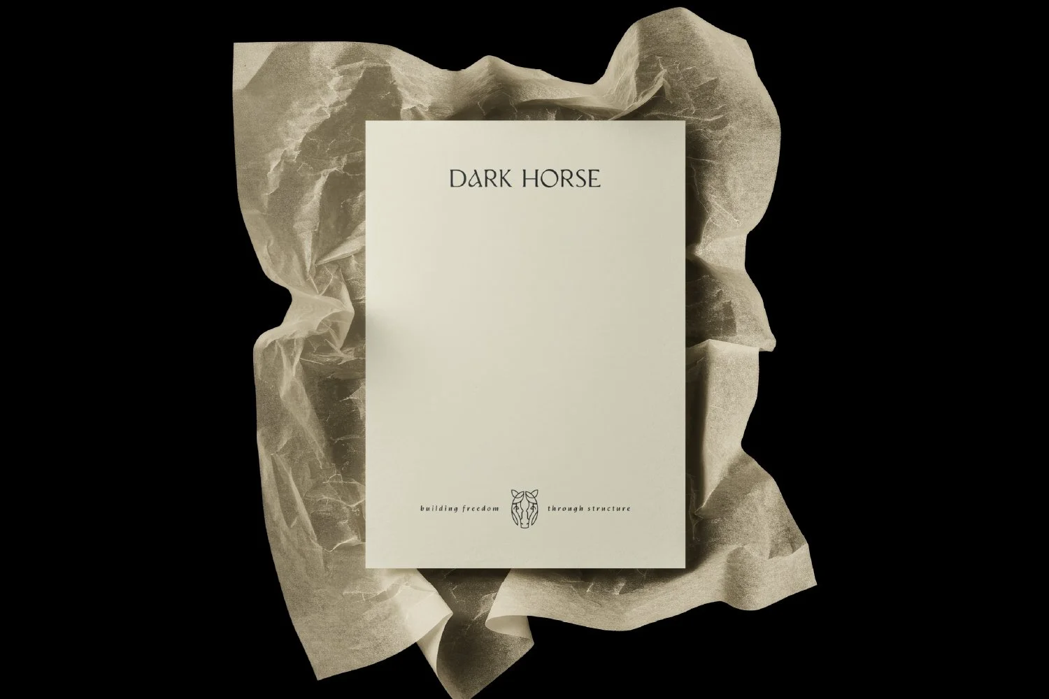
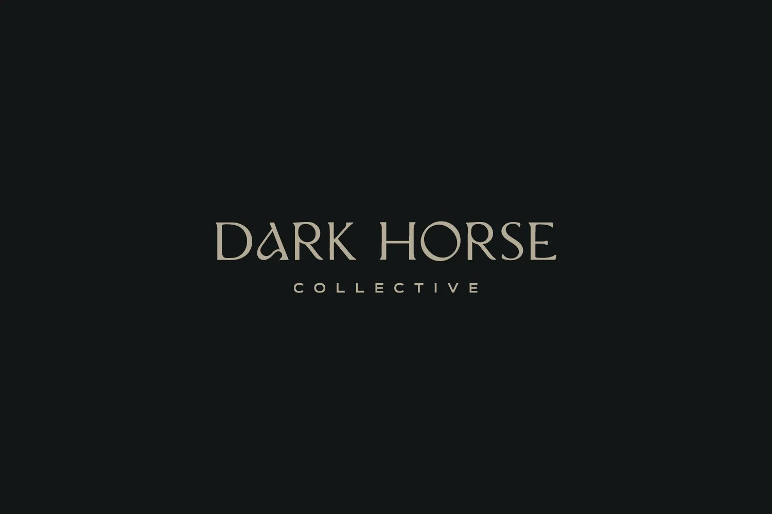
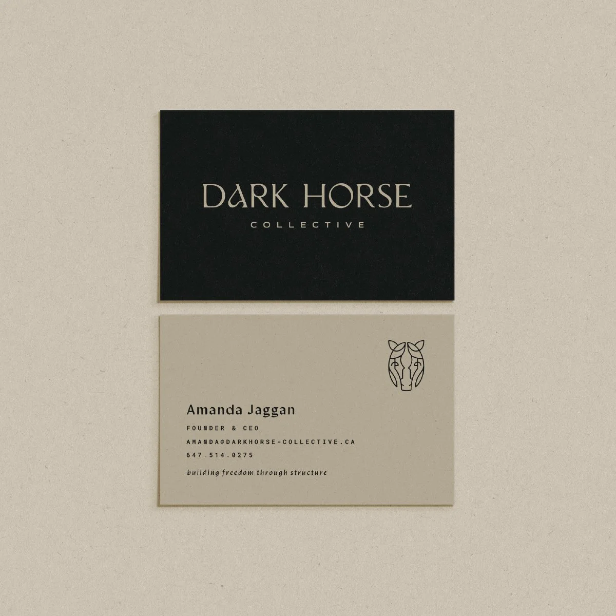
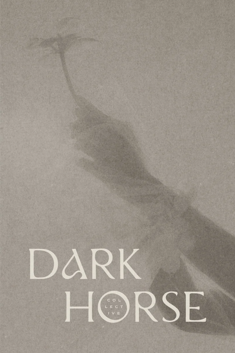
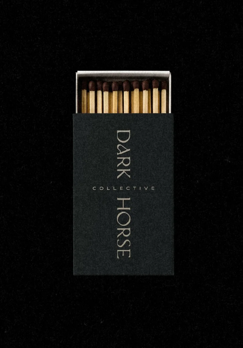
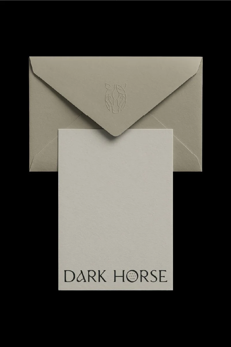
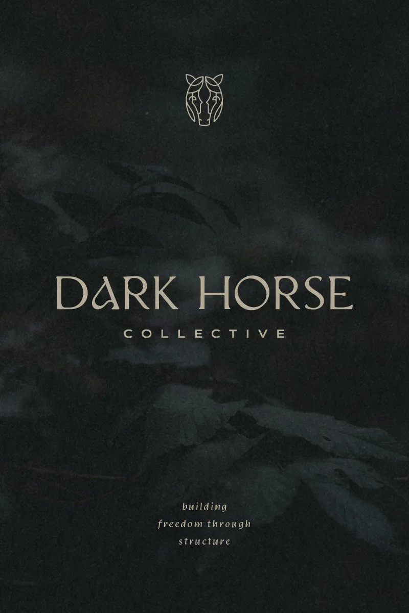
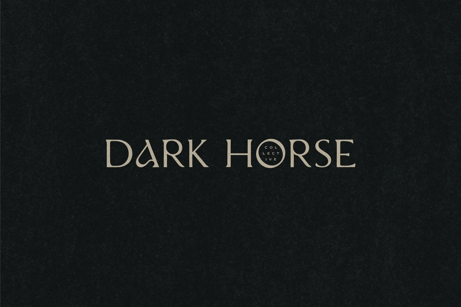
The Dark Horse Collective master logo unites the horse mark and logotype into a bold and beautiful brand statement. The master logo is used more sparingly to set the brand tone in contexts where it has plenty of room to breathe. Meanwhile, the primary logo and mark can be used independently at large and small sizes as well as over images, making this a truly powerful and versatile identity system.
-
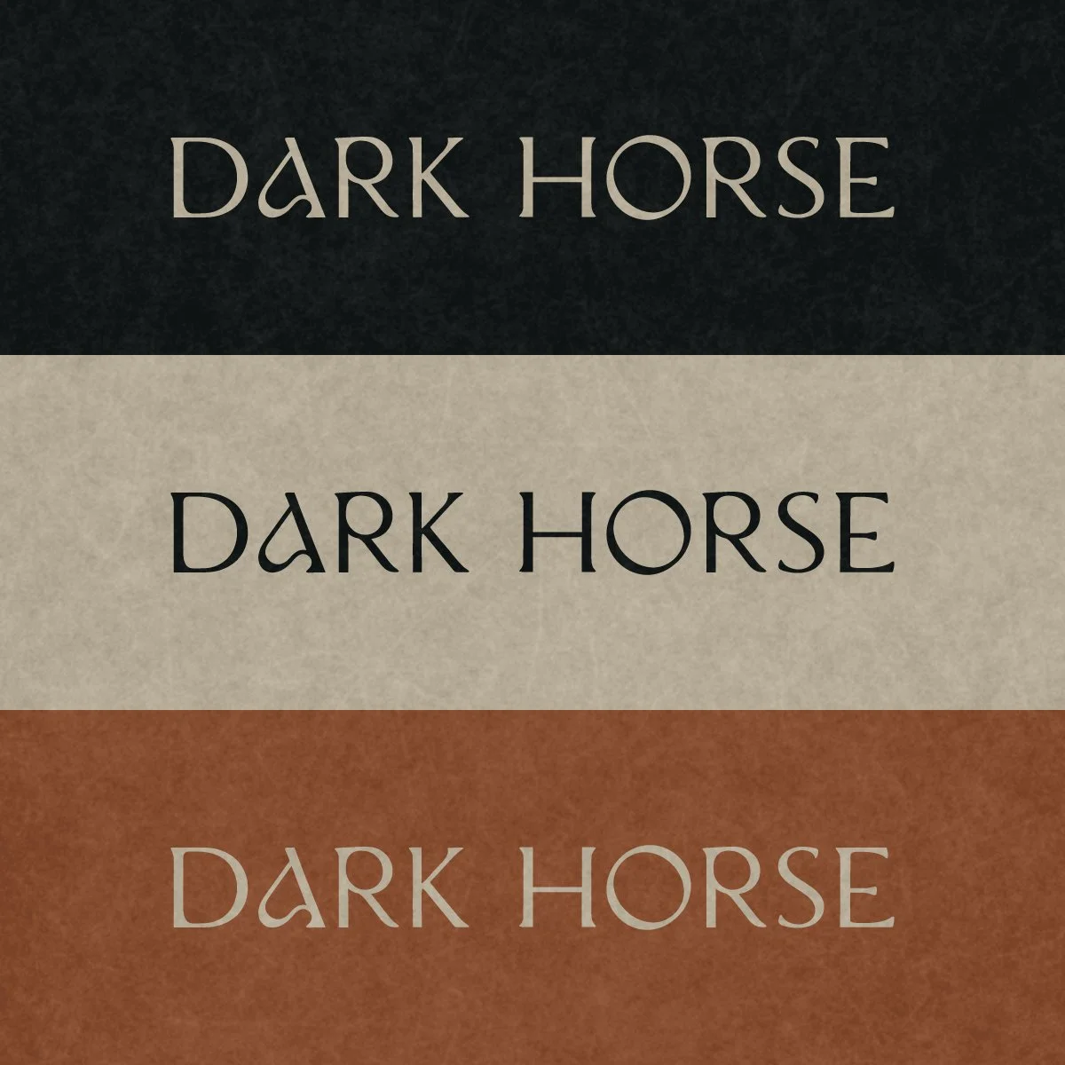
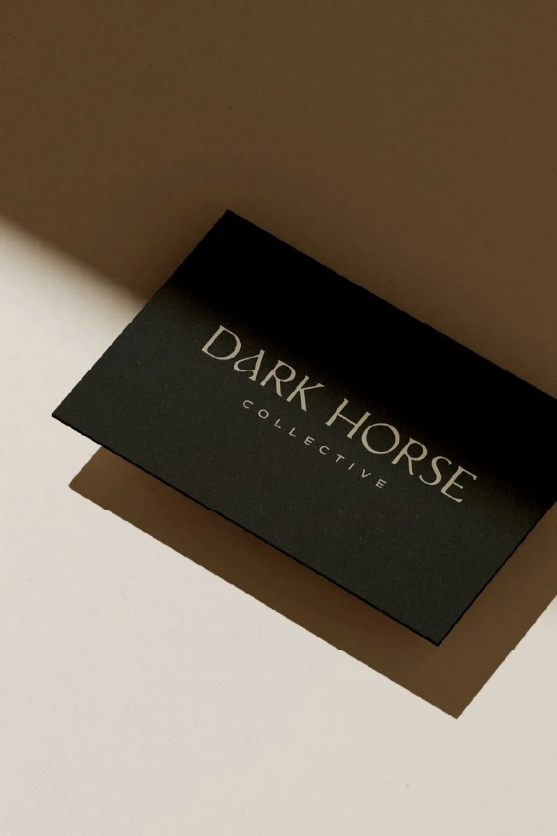
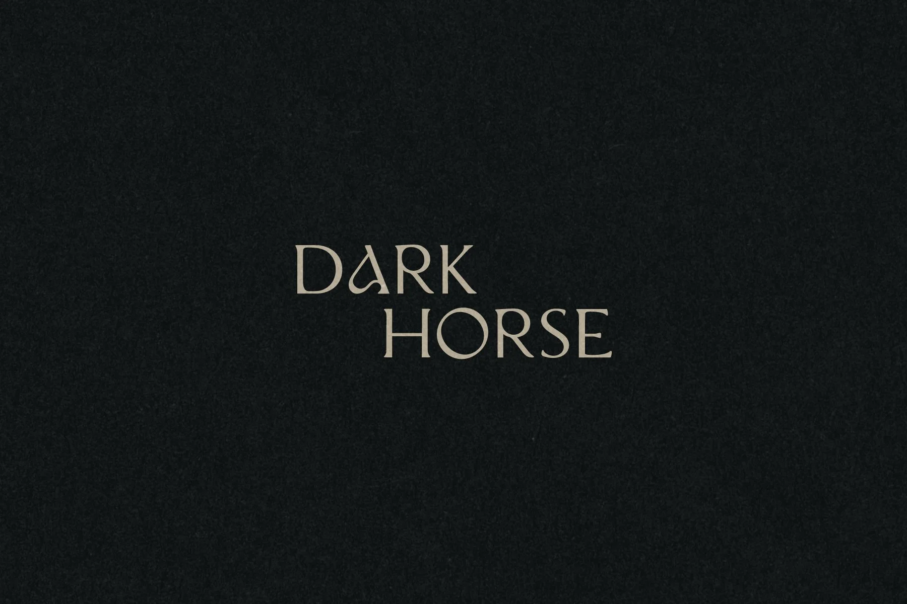
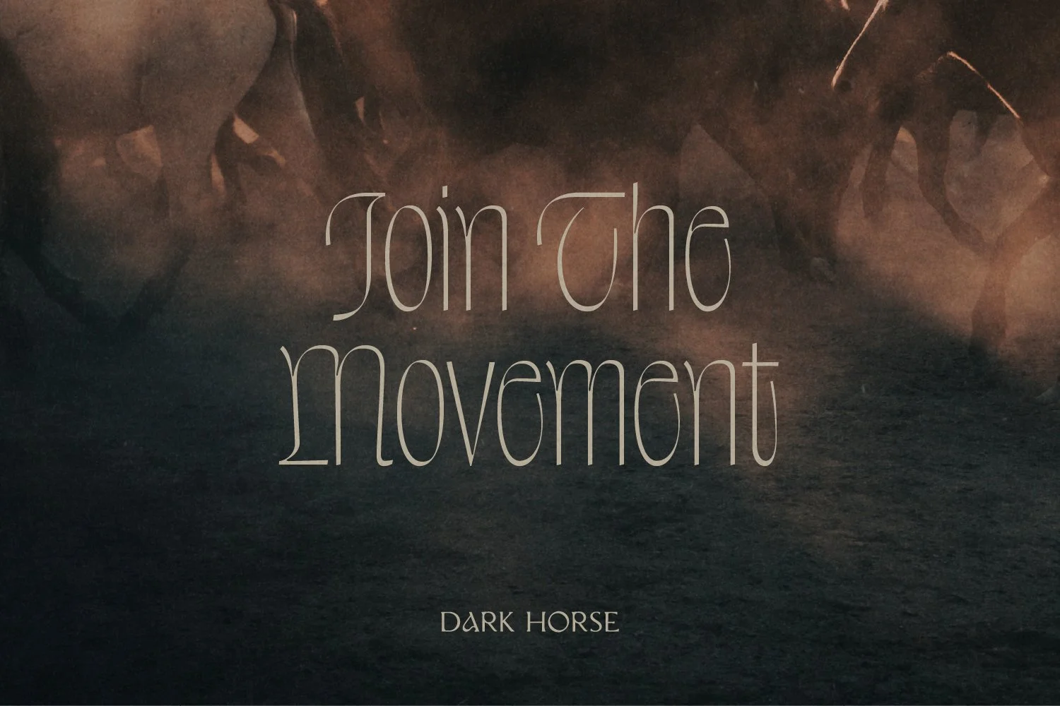
The Dark Horse Collective logotype is made up of a stunning serif typeface that’s been customized to strategically remove certain serifs to give a modern edge to the logo’s timeless tone and sense of heritage.
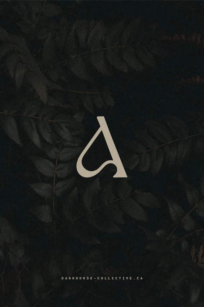
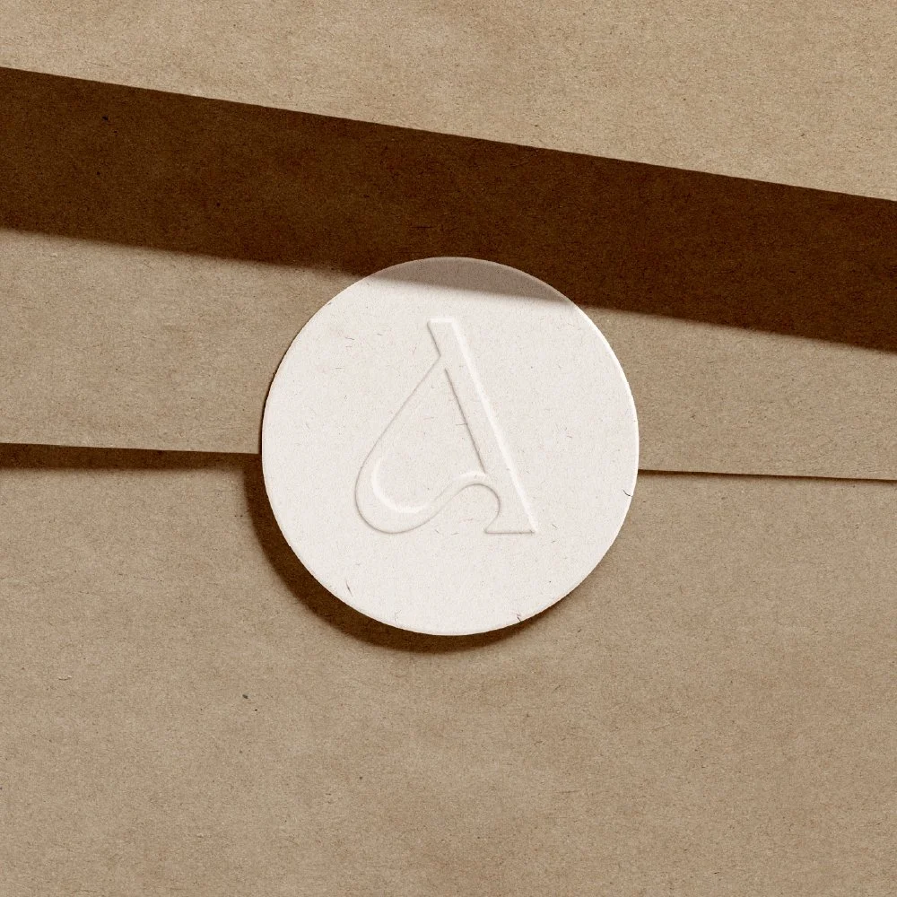
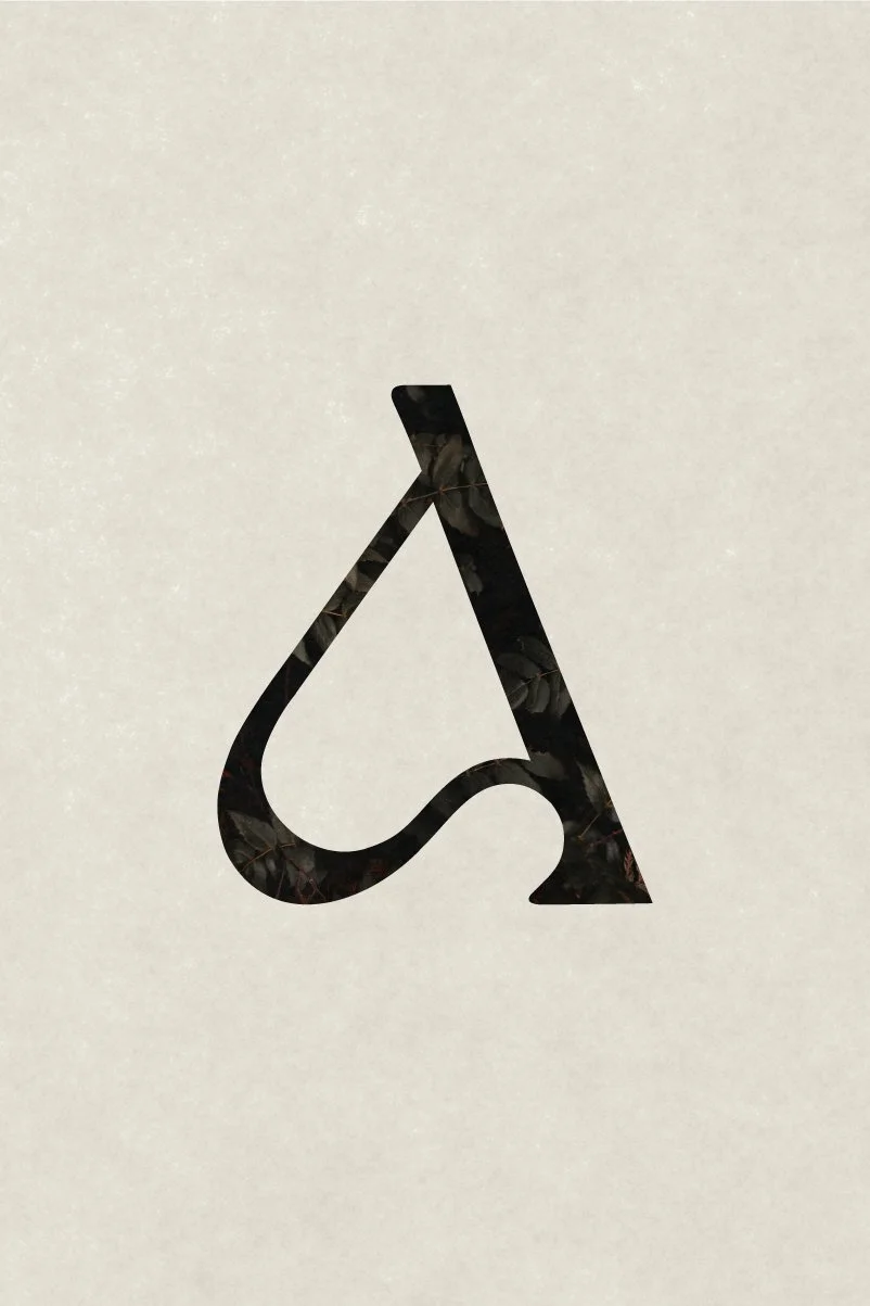
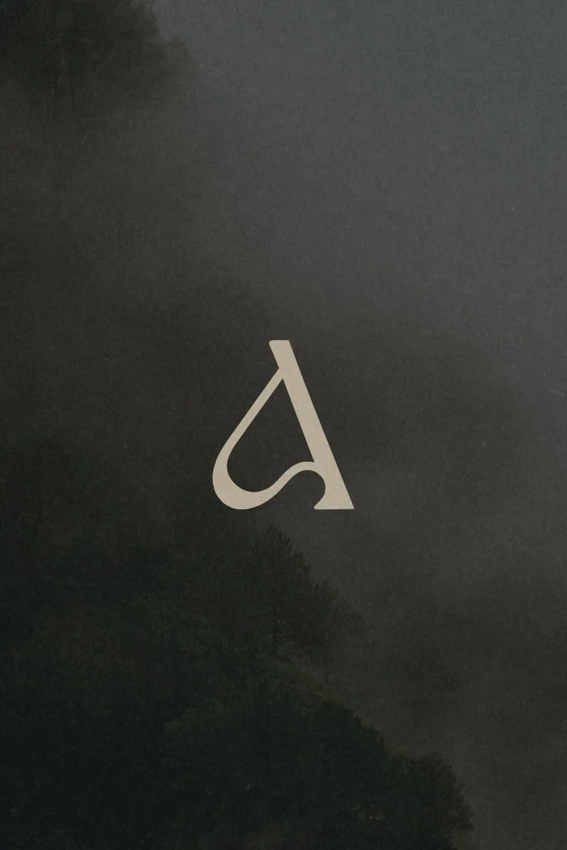
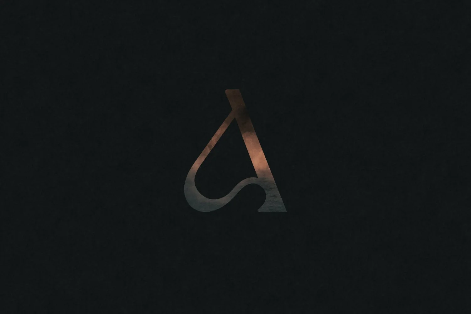
The logotype includes a completely custom “A” letterform which is crafted to emphasize a sleek form with a sculptural minimalist and organic avant-garde style, while also hinting at the abstract form of a horse.
-
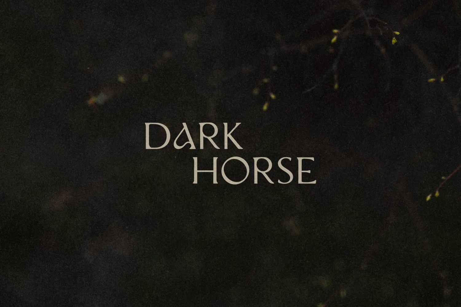
While the primary logo includes the word “Collective” set in a fresh yet timeless sans serif typeface, the secondary logo allows “Dark Horse” to stand alone for a bold standout impression in contexts in which the full brand name is already known or written elsewhere.
-
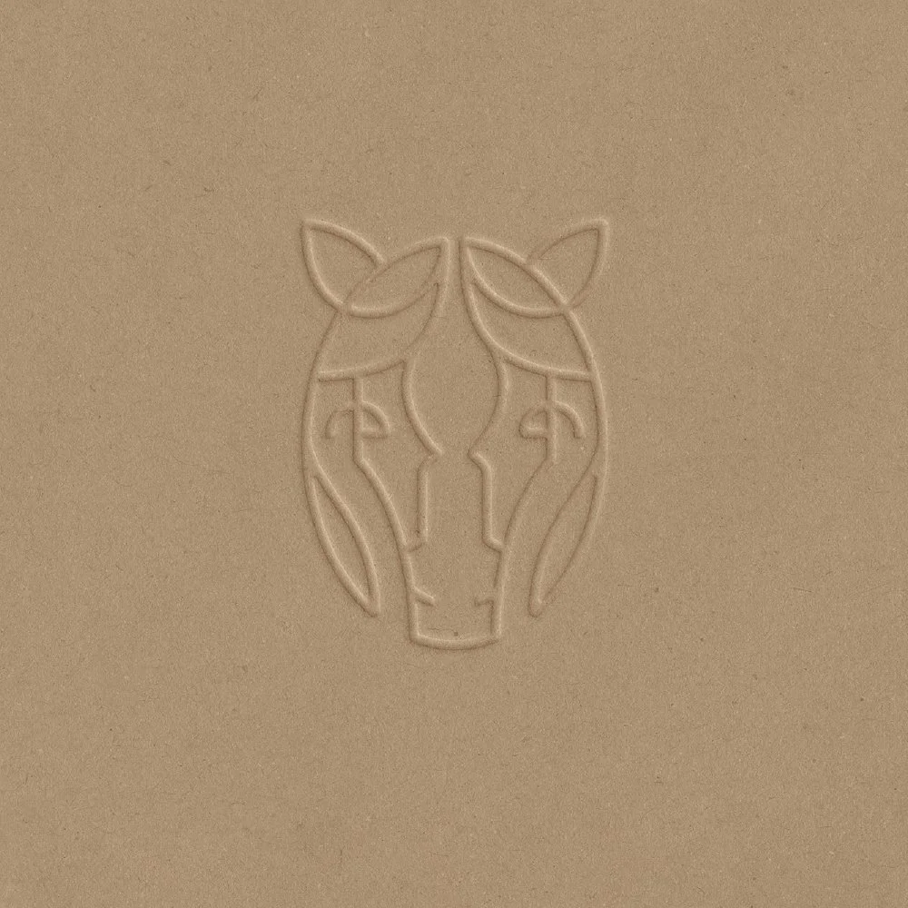
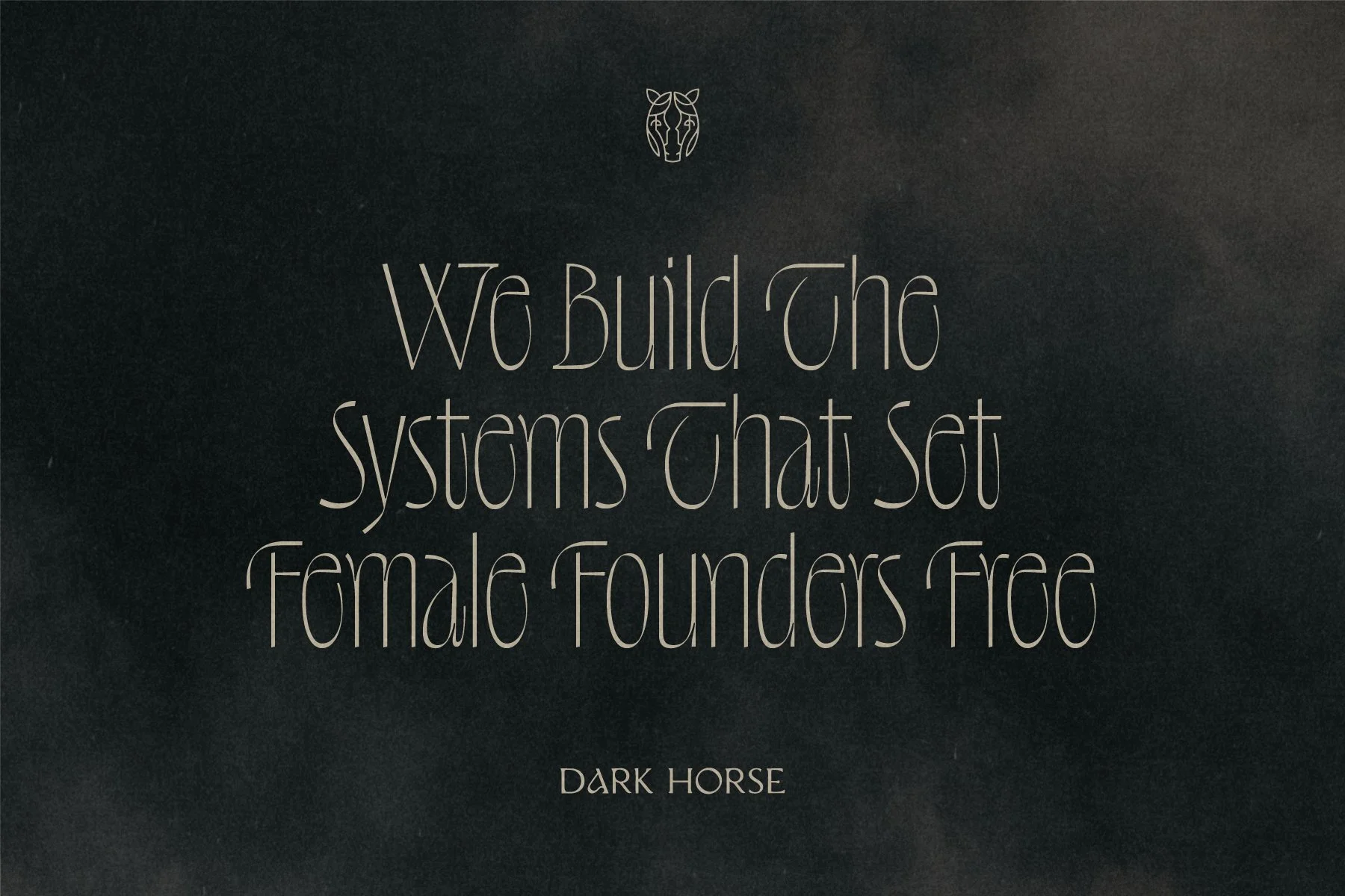
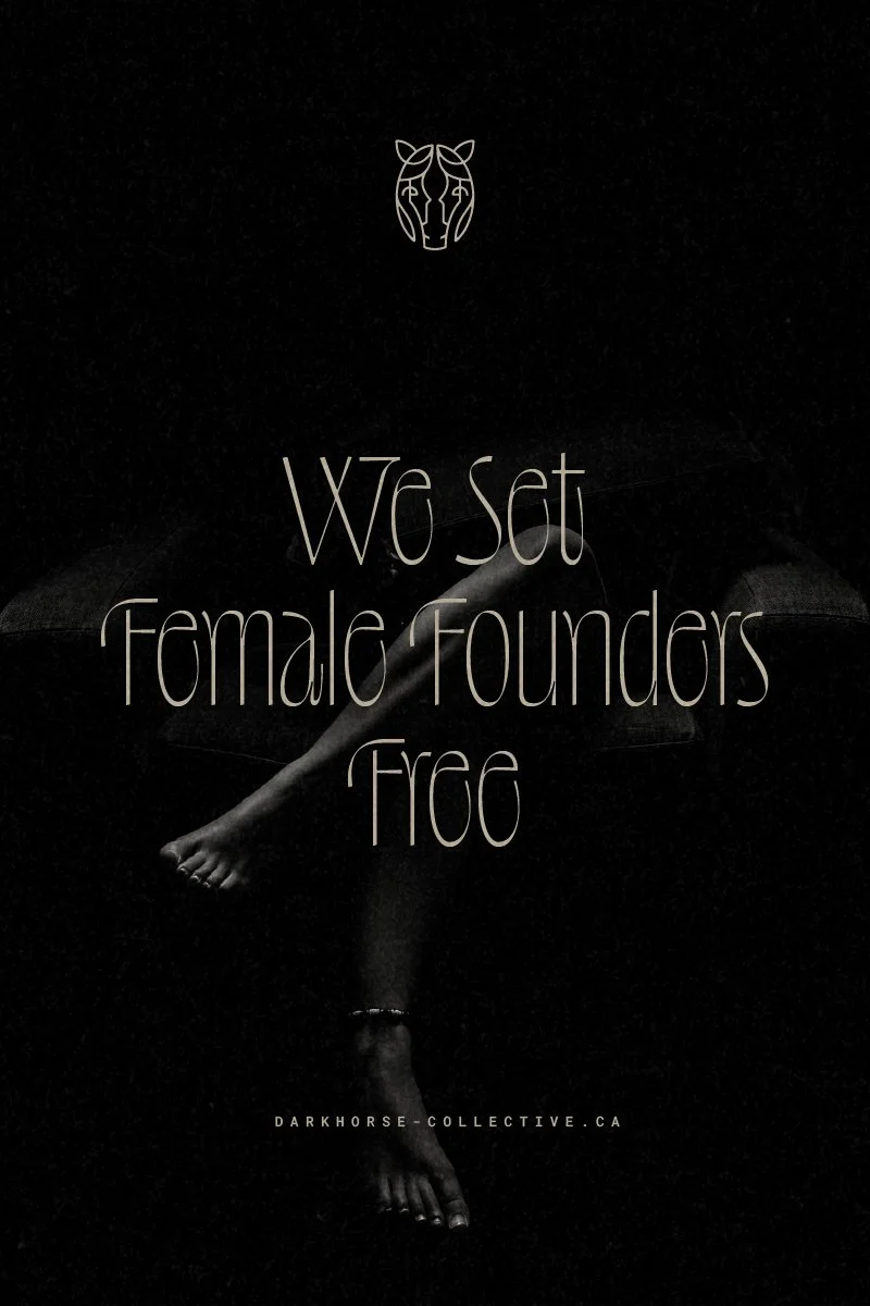
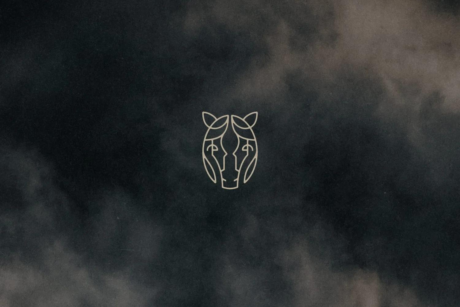
The DHC horse mark encompasses the modern nomadic and ritual minimalist style of the brand, which feels fresh and established at the same time. This emblem depicts the stylized face of a horse with the hidden profiles of two women facing one another within it.
This clever mark speaks to the passionate women who make up the DHC team as well as the women-led and run businesses who seek out Dark Horse’s bespoke approach to business consulting.
The mark encompasses Dark Horse’s mission — to foster a movement of women empowering one another to unlock their full potential, grow, expand, and thrive.
-
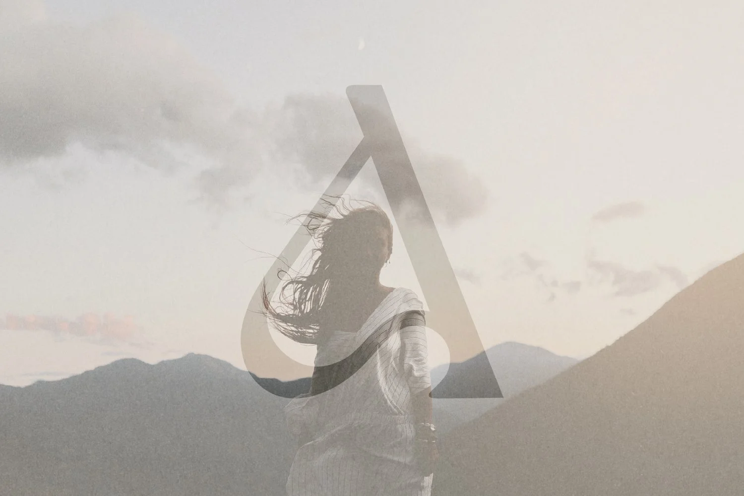
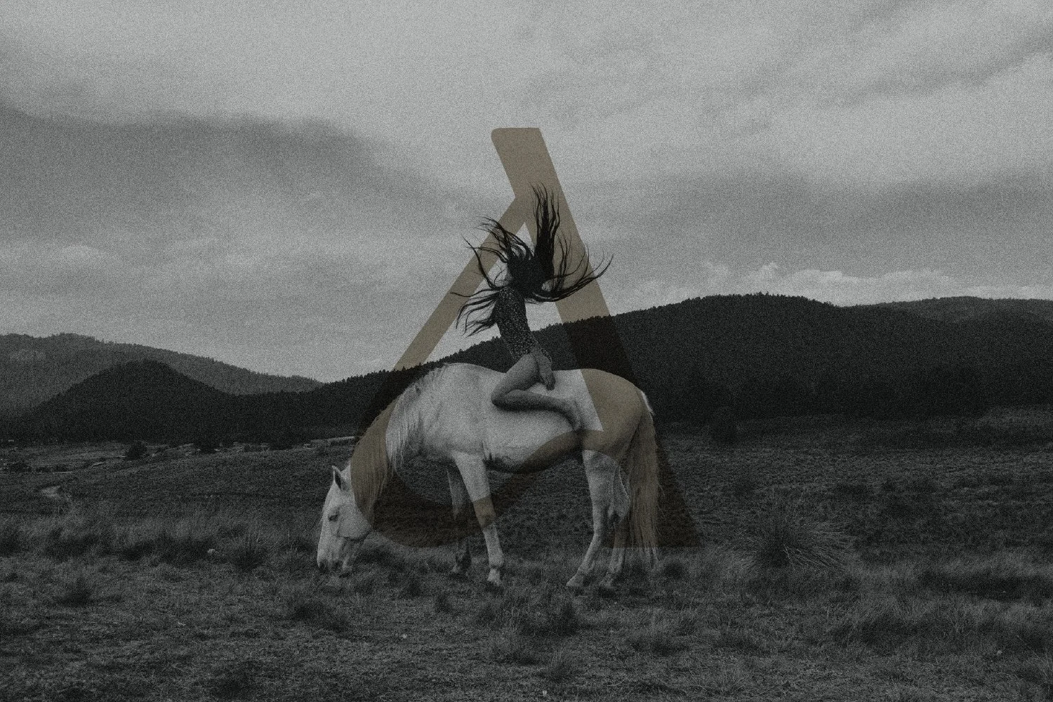
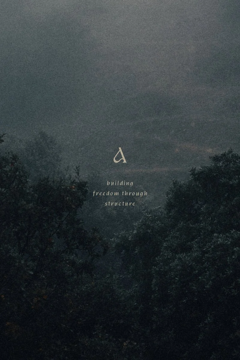
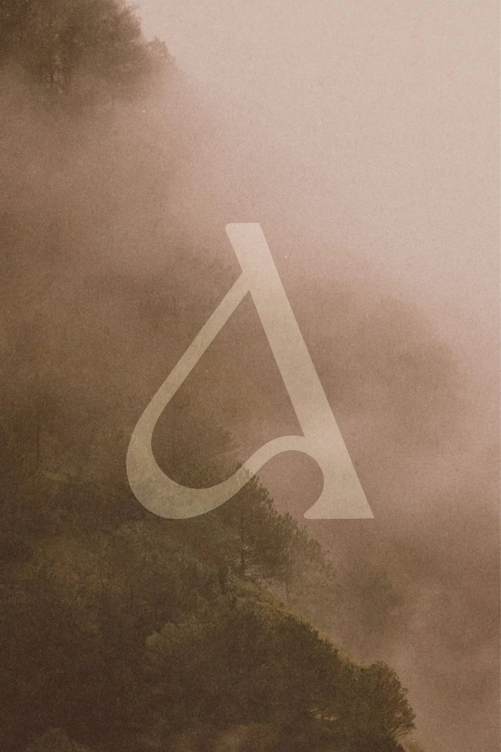
The DHC submark pulls the “A” letterform from the logotype to stand on its own. While this sophisticated brand mark works beautifully in small subtle contexts like the website favicon where the brand mark would be too detailed, it also makes a bold and unforgettable brand impression when used at larger sizes.
The organic curves and bold contrast of the mark fit with the brand tone of organic avant-garde, nomadic modernism, and sculptural minimalism, while the form hinting at a highly stylized and abstract horse is an unexpected delight.

Kind Words
“When I started Dark Horse Collective, I knew I was building an empire, and I wanted it to feel professional but also personal to me. I also knew I wanted to be intentional about who I build it with, whether that's partners or clients. I look for women with soul. Women who are passionate about their work and see their business as a way to empower others, not just a transaction. That's rare right now, when so many people are cutting corners with AI and looking for the cheapest option.
When I came across Melissa's work, I could see the effort, heart and soul she puts into it. I didn't know much else, but I took a leap of faith to invest in my business and support another woman entrepreneur.
What Melissa created for Dark Horse went beyond anything I could have imagined: the symbolism behind the logos, the thinking behind the submark, every detail. She is the creative force behind the Dark Horse Collective brand, who brought so much meaning and intention to every detail.
I’m so grateful for Melissa and can’t recommend her enough! If you want branding with heart, soul and serious chic, talk to Melissa Yeager ♥”
— Amanda Jaggan, Dark Horse Collective
